
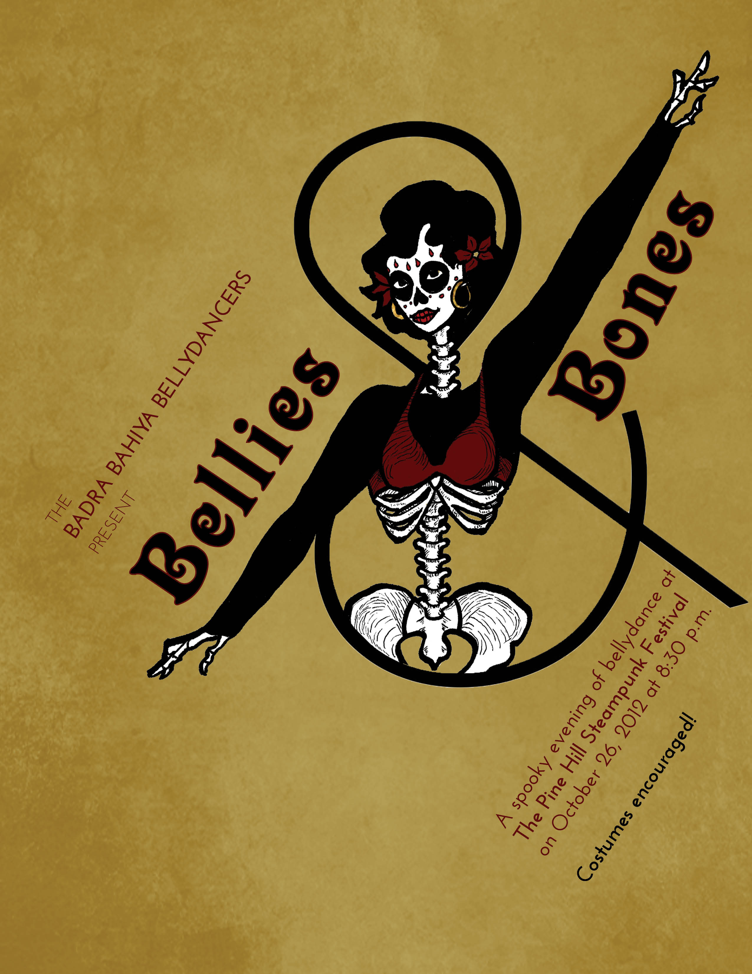
Bellies & Bones
As the client expressed an attraction to Soviet Era Propaganda posters, I put the type on a harsh diagonal and let the lines of the drawing be heavy to mimic woodcut prints. I used a decorative typeface combination that was in keeping with the spirit of the event.
Ink + digital media
September 2012
